"WHEN" WILL IT SNOW?
Everyone’s Asking "WHEN" Recession Hits and the Stock Market tops. The Right Questions Are WHAT to Watch and WHERE to Look.

Recession doesn’t arrive by surprise. Just like the weather, it gives signs - in yields, Stock Market Momentum, the Labor Market, and more. Ignore the calendar. Read the temperature.
I remember as a child anxiously watching the weather forecast, waiting for the first snow of winter. The meteorologist would predict snow tomorrow, and I’d go to bed excited – only to wake up to clear skies. Day after day, the snow kept not coming when expected. But crucially, the conditions for snow were building: the air was frigid, the clouds heavy. It was only a matter of time. In my career as a macro economist and market analyst, I find myself in a similar position today – waiting for the economic “snow” to finally fall. I’ve been forecasting a major downturn – a “winter” for the markets – and like the weatherman, I’ve had to watch the sun shine longer than anticipated. The question isn’t if it will snow, but when.
Each passing week, new data rolls in that reinforces my view: the conditions for a recessionary storm are all in place. Yet markets continue to bask in what feels like a late-autumn sun. Investors ask, “Where is the recession you warned about? Where’s the crash?” It reminds me of those frustrating winter days when you know snow is overdue. Just because it hasn’t fallen yet doesn’t mean it won’t – it means it’s likely to hit even harder when the clouds finally burst. Let me walk you through the key signals I’m seeing in the economy and markets, using the “snow” metaphor to make sense of why I’m convinced a blizzard is imminent, even as others are still enjoying the sunshine.
The Yield Curve: A Storm Signal
One of the most reliable predictors of an economic storm – our equivalent of heavy leaden snow-clouds on the horizon – is the yield curve. An inverted yield curve (when short-term interest rates are higher than long-term rates) has long been a warning of recession. But an even more telling sign is what happens next: after inversion, the curve steepens rapidly as short-term yields plunge. It’s like the moment when the temperature suddenly spikes upward after staying below freezing – that shift often heralds the snowstorm’s arrival.
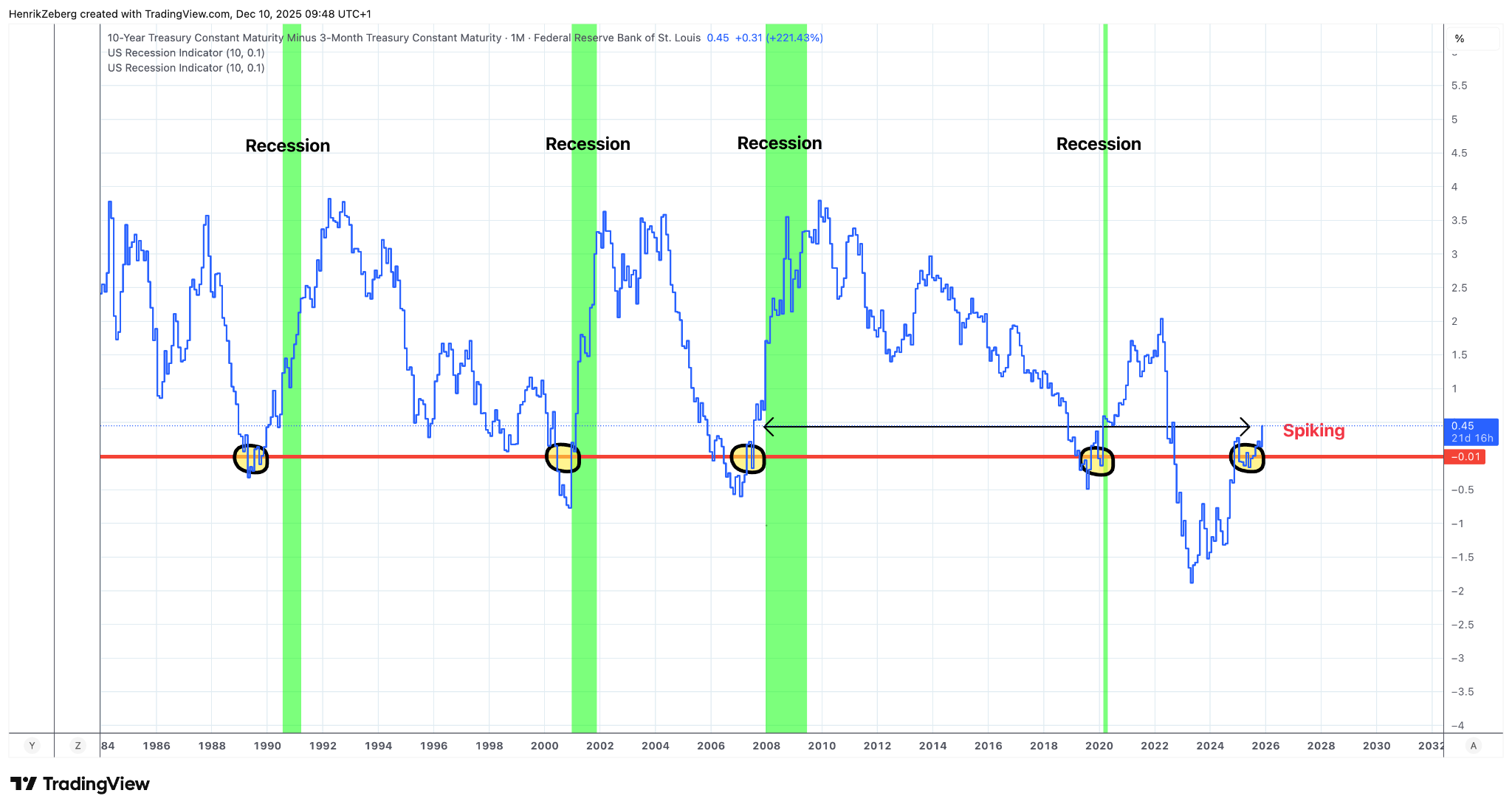
Chart: The difference between the 10-year and 3-month Treasury yields (blue line) turns sharply upward after each inversion (red line at 0), just before recessions (green bands). Currently, the yield curve is spiking back up from deep inversion, a classic pre-recession pattern.
Historically, each time the yield curve has flipped back to steepening following an inversion, a recession has followed almost immediately. I can see it clearly in the chart above: prior to the 1990 recession, the curve steepened dramatically; the same happened before the 2001 dot-com bust and the 2008 financial crisis. Why does this happen? Because the Federal Reserve panics and starts cutting short-term rates even as long rates remain relatively high – a response to economic stresses already underway. In essence, the bond market “smells” the coming snow. Today, that exact steepening is occurring. The 10-year vs 3-month yield spread has surged from deeply negative to positive territory. In my view, this is the final confirmation that the economic winter is about to hit. I am not merely speculating; every major recession in modern history was preceded by this kind of lurch in the yield curve. The storm signal is flashing bright.
The Fed Pivot: Neckline Broken
Interest rates often follow a distinct pattern over the business cycle. Early in an expansion (the “early phase”), rates are low and rising. Late in the cycle (the “late phase”), the Fed’s hikes push short-term yields to a peak. Then something breaks: the Fed pivots, short-term yields collapse, and a recession ensues. I track the relationship between the 1-year Treasury yield and the Fed Funds rate closely – it’s a way of visualizing the Fed’s tightening cycle turning into an easing cycle. Right now, that relationship is screaming that the transition is at hand.
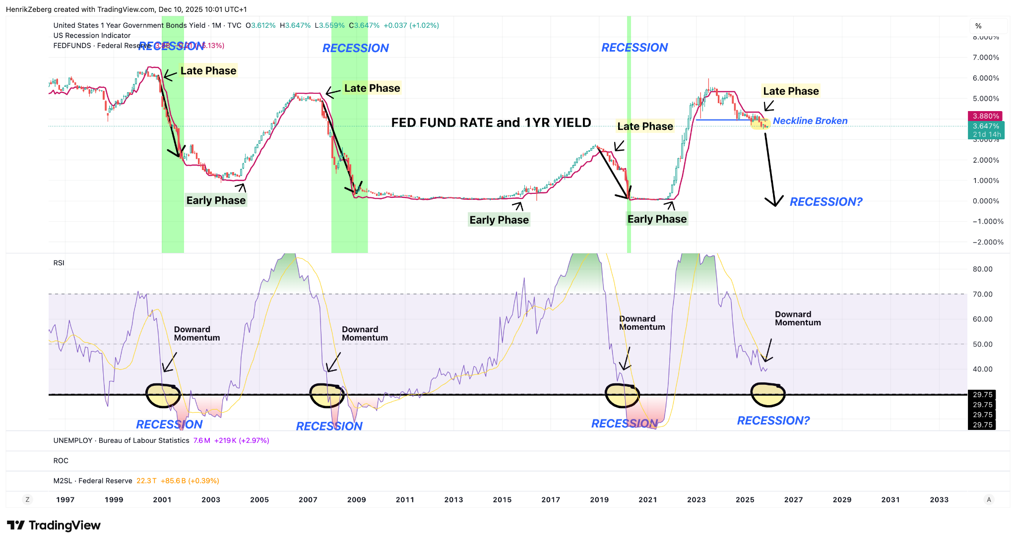
Chart: The 1-Year US Government bond yield (teal line) versus the Fed Funds rate (red line), highlighting “Early Phase” (rising rates), “Late Phase” (peaking rates), and the moment the neckline breaks (yellow highlight) when the 1-year yield falls below the Fed rate. In past cycles (green recession bands), this break signaled the onset of recession. Currently, the 1-year yield has just undercut the Fed Funds rate (see “Neckline Broken” annotation), indicating the Fed pivot.
In the chart above, I’ve labeled past cycles for clarity. Notice how before the 2001 recession, and again in 2007, the 1-year yield (which moves with market expectations) started dropping ahead of Fed rate cuts – that’s the market anticipating the pivot. I call this drop the “neckline” of a figurative head-and-shoulders pattern. Once broken, it’s a point of no return: the economy is sliding into the downturn. Right now, that is happening – the 1-year yield has begun to fall from its peak even while the Fed’s official rate hasn’t yet been cut. In my analysis, this confirms we’re leaving the late phase of the cycle. The Fed will soon be forced into easing mode. Just as a sudden thaw can precede a blizzard (warm air rising to unleash the cold front), a sudden drop in short yields precedes the economic freeze. All signs suggest we are at that pivotal moment where monetary conditions are flipping. I cannot overstate this: this pattern has never occurred without a recession following. To me, it’s as if I’m watching the mercury plummet on a barometer – a storm is virtually assured.
Consumer Confidence: The Deep Chill in Sentiment
If you want to know how people feel about the economic weather, look at consumer confidence. When a snowstorm is brewing, animals scurry for shelter – in the economy, consumers pull back, hunker down, and their confidence plunges. Lately, U.S. consumer sentiment has absolutely cratered. In fact, it’s so low that one has to ask: Are we heading towards a depression? The University of Michigan Consumer Confidence Index is hovering near levels typically seen only during or right before nasty recessions.
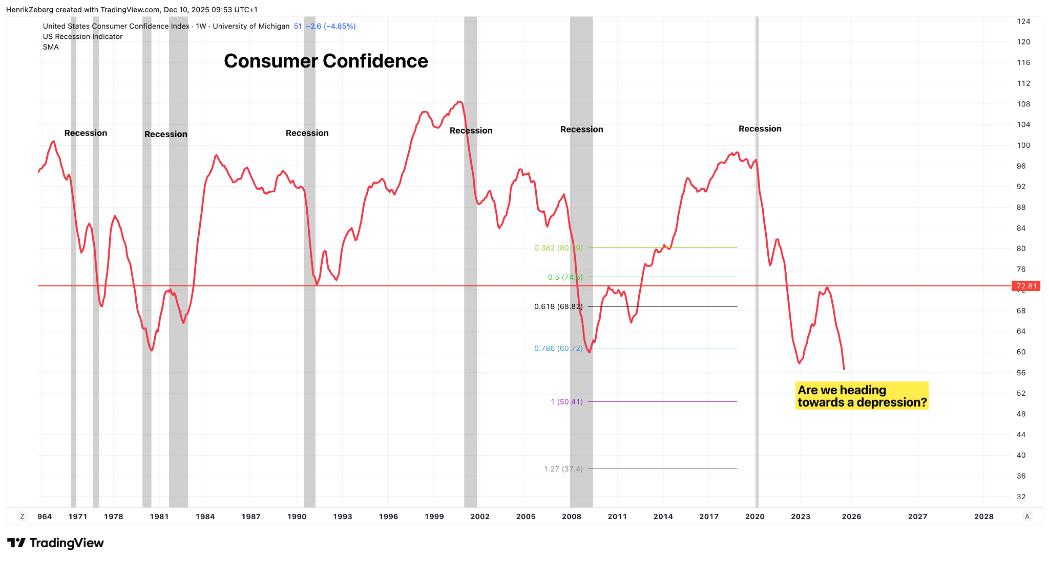
Chart: The University of Michigan Consumer Confidence Index (red line) since the 1960s, with recessions shaded gray. The index now sits around 51 – a level that rivals the worst troughs of past recessions. Green and blue lines mark Fibonacci retracement levels of prior sentiment cycles (e.g., 0.382, 0.5, 0.618), suggesting how far sentiment has fallen. The recent plunge (right side) has broken through multiple retracement thresholds, prompting the question in yellow: “Are we heading towards a depression?”
